Case study Identity · Web design · Development · Motion · SEO
Paola Nails
Black, gold and the nail art centre stage.
Identity and website for a nail studio in Szczecin — from the logo and the "Golden Glam" motion to a filterable gallery and simple, form-free contact.
Visit the live site (opens in a new tab)- Client
- Paola Nails
- Sector
- Nail studio
- Year
- 2026
- Scope
- Logo, identity, design, development, SEO
- Contact
- Phone, Messenger, Instagram — no online booking


At a glance: Challenge, Solution, Delivered outcome
- Challenge
- Show real nail work without the frame upstaging it, and lead to contact the way the salon actually books — through a conversation.
- Solution
- A Black & Gold identity carried from the logo to the interface, restrained motion, a filterable gallery and one-tap contact, on a lightweight static site.
- Delivered outcome
- A live, indexed salon website at paolanails.pl where the nail photography takes the lead.
My role
- Logo and visual identity
- Visual direction and design system
- "Golden Glam" motion
- Development (Eleventy, Sass, JavaScript)
- Filterable gallery with a lightbox
- Responsive layouts
- Local SEO and performance
- Deployment, consent-aware analytics, testing
Stack
Context
A showcase and the shortest route to an appointment
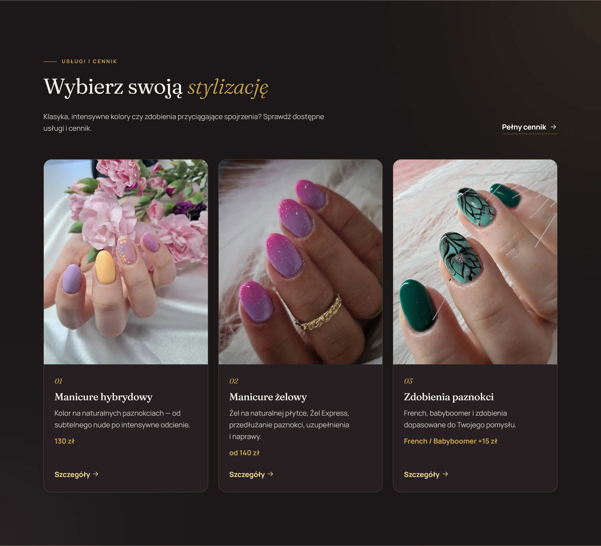
Paola Nails is a nail studio in Szczecin — gel polish and gel manicures, extensions and nail art. The website has two jobs. It shows the work in the best possible light, and it leads to contact by phone, Messenger or Instagram.
The salon does not take online bookings, because appointments are arranged individually, in conversation. So the site doesn't pretend to be a booking system — every call to action leads to direct contact.
Identity
From the logo to the whole interface
I designed the logo and carried its character across the whole site. The deep black and metallic gold come straight from the mark, and the button gradient echoes the gold ribbon bearing the words "Stylizacja paznokci". Light, ivory sections alternate with the dark ones, and pink is only an accent — the colour should come from the nails.
Headings are set in Fraunces, a serif with a gold italic, and body text and UI in the modern Manrope. Photos sit in arched frames with a gold line, and the arch recurs throughout the site.
- Black #0F0B0C
- Gold #C9A24B
- Ivory #F7F2EE
At ZIEN Studio, visual identity is a supplementary service — usually alongside a website, and as a separate project where that makes sense. All services

Motion
"Golden Glam" — sparkle, in moderation
Eight gold sparkles (five on mobile) fade in slowly around the logo and the photo, each on its own 7–11 second cycle. Roughly every eight seconds a gold shine sweeps across the main button.
Gallery tiles zoom by 3% on hover, and sections reveal with a 14 px shift and a 90 ms stagger. Only transforms and opacity are animated, so the motion stays light on the browser. With reduced motion enabled, every effect switches off.

Gallery
The nail work takes the lead
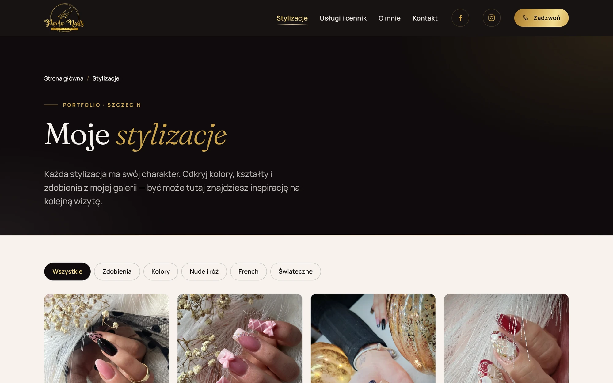
The gallery shows 19 photos in five categories — nail art, colours, nude and pink, French and seasonal. Filters work without a page reload, and the enlarged view opens in a native dialog with a photo counter.
Images are generated in several widths as AVIF, WebP and JPEG, with dimensions that prevent layout shift. The import step strips EXIF data and GPS location.


Services and contact
Contact that matches how the salon works
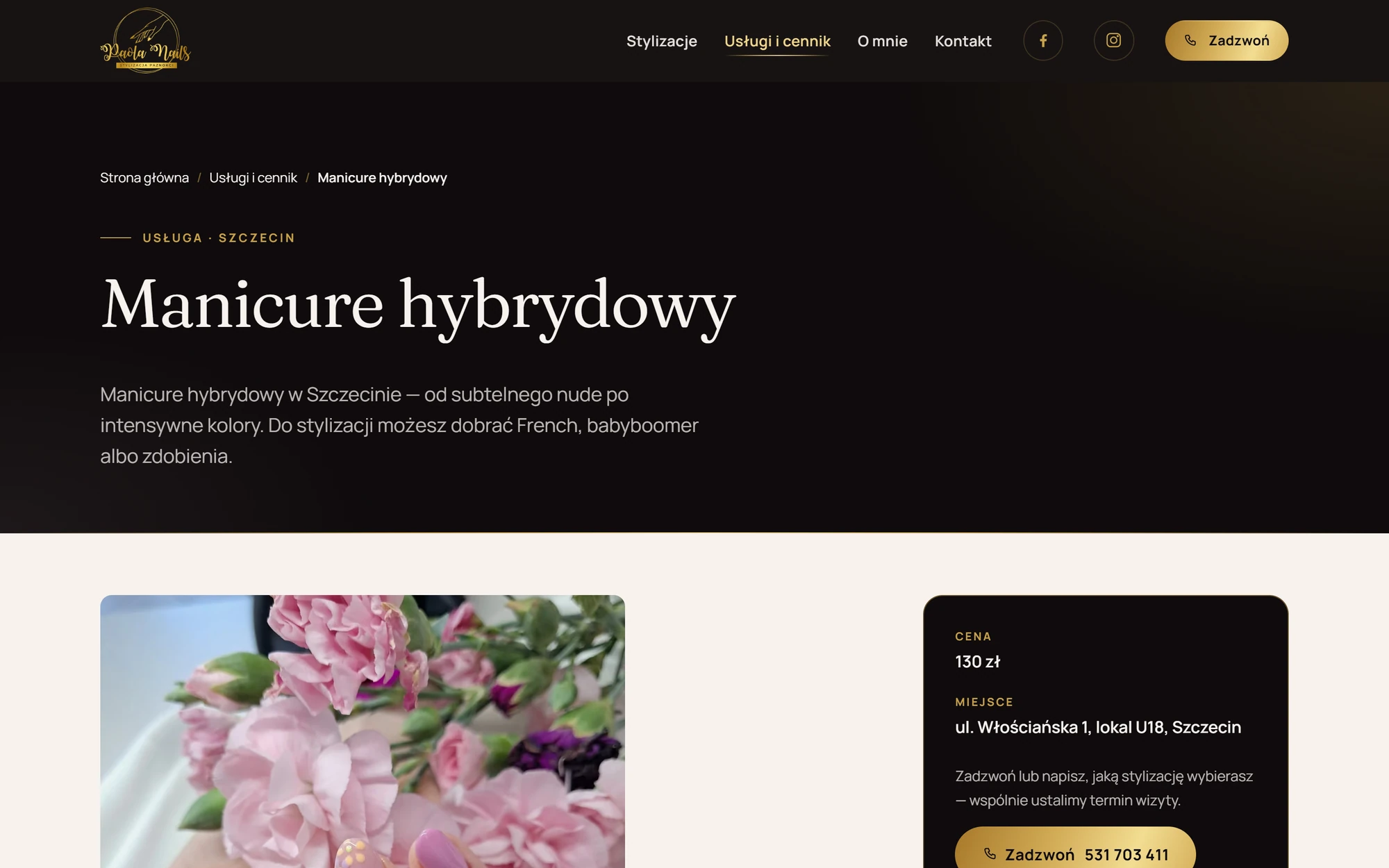
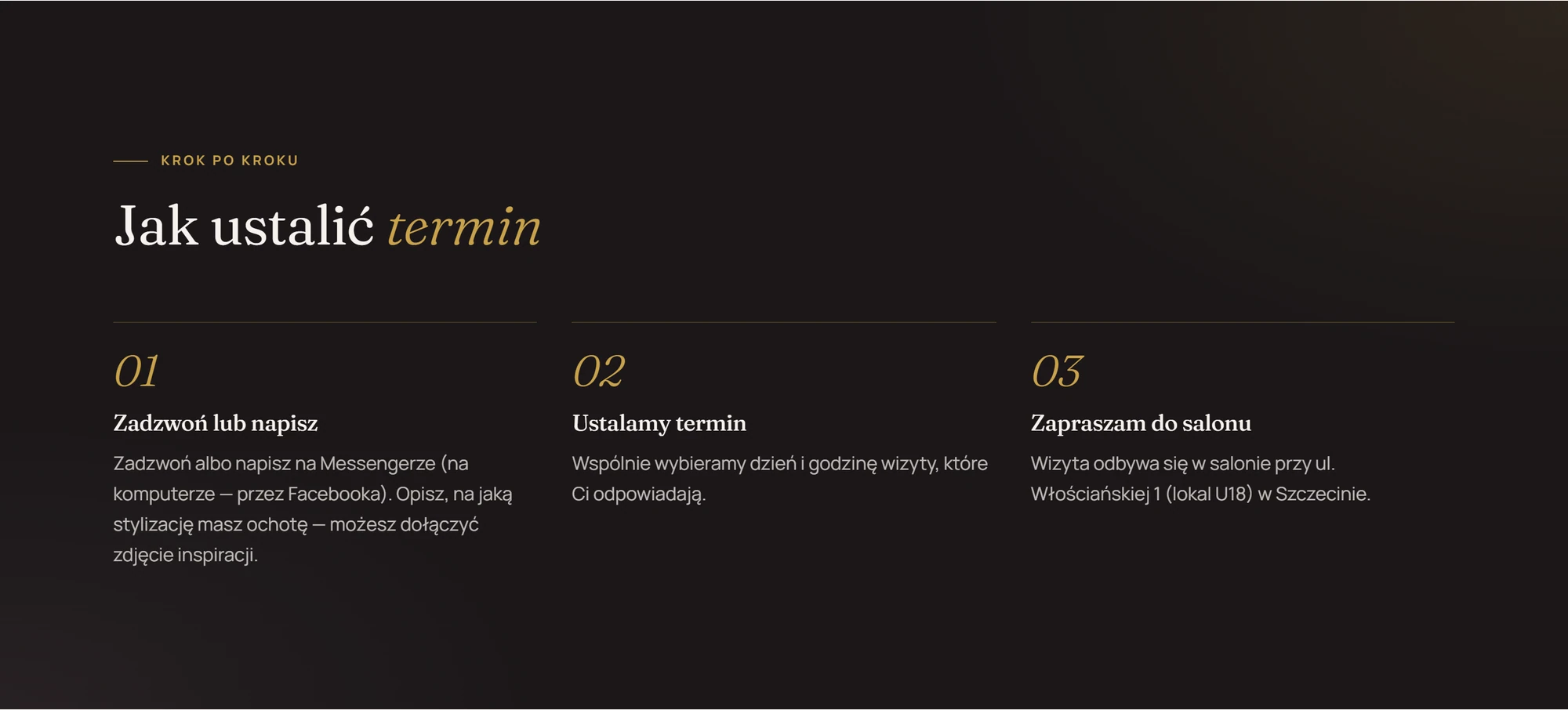
Each service has its own page with a price, a description and FAQs. Instead of a form and a calendar, the site explains three simple steps — call or message, agree a date, come to the salon.
Contact buttons sit wherever a visitor might decide — in the header, on the first screen, next to services and at the end of every page.


Mobile
The phone as the main device
On a phone the first screen shows the headline and two buttons straight away — Call and Messenger. The menu opens as a full-screen dark panel with large serif links.
While scrolling, a quick-contact bar stays at the bottom of the screen and hides when the menu, the gallery viewer or the consent banner is open. The gallery switches to two columns and the enlarged view supports swipe gestures.


Technology and quality
Fast, static and tested automatically
Eleventy 3 generates pages from data — services, prices, FAQs and the gallery are JSON files, with no back end or database. Bootstrap 5.3 comes in through Sass with only the modules needed, and all the JavaScript is one small bundle (about 5 KB compressed). Fonts are self-hosted.
CSP and HSTS headers are in place, and GA4 with Consent Mode v2 loads nothing before consent. CI tests check HTML, links, structured data and accessibility (Playwright + axe) at four screen widths.
Each service has its own page with the price in the title and description, and the location appears in headings, titles and NailSalon structured data.
Measurements
- Performance
- 97–100
- Accessibility
- 100
- Best practices
- 100
- CLS
- 0
Single lab runs, not field data from real traffic.
Contact
Have a website in mind? Let's talk.
Send me a few lines about the project — what the business does, what the site should achieve and when you need it. I reply personally.
Opens your email app.